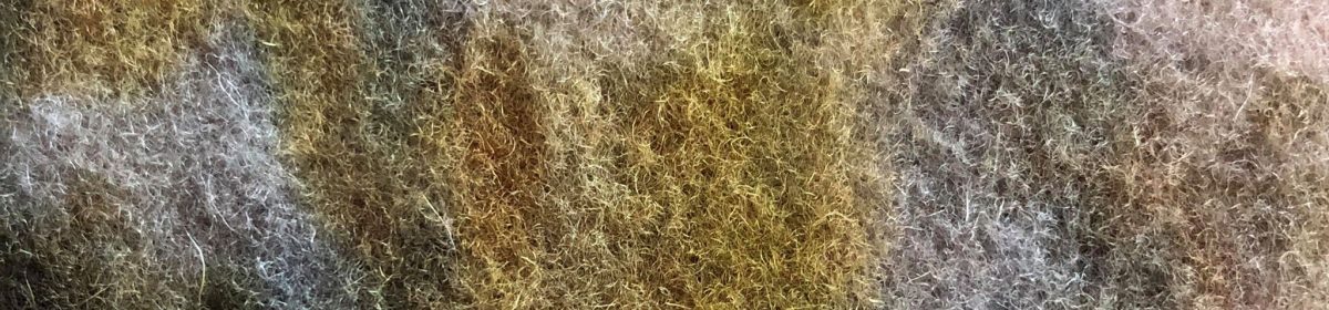
When I had a chat with David we talked about adding thing on top of the fabrics. Something that is hard to contrast with all the softness that is already there. I started to cut out strips of different bright coloured card and maybe laying this across the fabrics. Creating lots of lines going through all of the fabrics I have grouped together.


Here I had already got some blue card cut into strips and started adding this on top of the fabrics. I placed this over the yellows and into the pinks as the darker yellows are the closest I have to orange which is blue’s complimentary colour.


I then added a yellow again trying to make this go over the top of it’s complimentary colour which is purple.
This is a short 2 minute video just showing me placing the strips of colour over the fabrics. In the video I add green, red and orange. Again like the previous two strips I tried placing them over their complimentary colours aswell.


Here is what the piece looked like after I had added all the strips of colour. David was right about the contrast between the soft and hardness of the fabrics against the card. I really like how this has turned out and how it looks. Especially in the middle image it’s really striking.
