Intro into science of colour
Long before colour vision has been understood, painters were able to prepare and to mix colours to achieve the desired effects, and to create magnificent tableaus. This shows that colour science, i.e. the knowledge of the physiological and physical conditions of colour vision and colour generation, is not very important for the artists. Nevertheless, artist painters have consistently tried to find colour theories helping them to understand the essence of colours. But even when their theories were wrong or faulty, this was hardly harmful for their work and that of their scholars.
For the development of colour photography, colour TV, three- and four-colour printing, however, colour science has been essential. Colours had to be measured in order to be reproduced; the development of measuring methods and apparatus was paralleled by the investigation of the visual system. Today a picture taken with a digital camera may be printed with a good inkjet printer yielding excellent results. This would not have become possible without the scientific foundation of colorimetry.
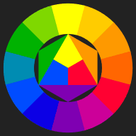
| Strangely enough, most people, painters in particular, are not familiar with the principles of colour vision. Colour theory for artists often does not go beyond the misleading colour wheel and colour mixing scheme of Johannes Itten.
Itten’s colour wheel and mixing scheme |
 |
The colour stimulus
Colour is carried by light, electromagnetic waves, but the sensation of colour is subject to many other influences, which makes its quantitative description difficult, to say the least.
For colour measurement, therefore, one uses “free colours” (or aperture colours), a structureless viewing field, and the only question is whether the two halves of the field are equal or not. This eliminates all additional clues we might get on the “true” colour of the object.
The light reaching the eye is called the colour stimulus. It is characterized by the spectral function which describes in physical terms its composition of radiation of different wavelengths.
Optical illusions, colour constancy
As the illumination in general is not uniform, the perception of gradual changes in lightness is suppressed, while abrupt changes which in most cases are important for the perception of shapes, are enhanced (“contrast”). What is of interest, is the shape and the “true colour” of an object, where the vague notion of true colour may be defined as the colour seen under “normal” circumstances at daylight. The colour stimuli depend on the illumination and on the absorption properties of the things which we see. Their colour should not change when the illumination changes, and the visual system involves a lot of data processing to eliminate the influence of illumination on the perceived colour as much as possible.
The result of the data processing which is delivered to conscious perception is, so to say, the best guess of automatized (inconscious) evaluation routines on the shapes, colours, and distances of objects, which usually are quite reliable. Estimated 40 % of the brain are involved in vision. After the stimuli received by the eye are transformed to neural activity, everything which is likely to be due to imperfections of the eye or otherwise identified as “junk” is filtered out and is not seen. We do not see the shadows of the blood vessels in the retina which the light has to pass before it reaches the sensitive layer containing the cones and rods. Every visual signal which stays constant when the eye is moving is suppressed.
Contrast enhancement is strongest for abrupt changes of lightness – nice examples can be found in the internet, e.g. lightness demonstrations, while colour contrast is not so striking. But nevertheless, the colour produced by the same stimulus may even be named differently, depending on the surroundings:
What before a dark background may still be perceived as orange, appears brown on a white background. Click on the pictures to enlarge them! The effect is seen most clearly if the enlarged image covers the whole screen
Remitted light from the surroundings is part of the illumination. In a room with pink walls a white sheet of paper would be pinkish, but our visual system accounts for that by shifting the impression slightly towards the complementary colour (green in this case), so that the resulting impression is still “white”. In the case of flat images, this shift may be considered an optical illusion. – The two squares are coloured with the same grey, but the left one appears to have a greenish hue, the right one looks slightly pink.
After-images (see below) also contribute to colour contrast.
All the information here I have taken from this website to help me better understand the science behind colour.
https://www.itp.unihannover.de/fileadmin/arbeitsgruppen/zawischa/static_html/introcol.html