Through out the past five or six weeks after a little trip to Pairs I got my creative flare back and once I was home I began drawing again. One of the places that always feels like it inspires me is Italy. It is such a beautiful country. I began drawing some designs that I felt I could really get into. I have created a few designs not only of Italy but, New York, Amsterdam, Paris and Prague.
With this sketchbook I have explored with more mix media. One media I have enjoyed using was charcoal, this media gives me the sketchy look that I love in my stitch design. I don’t like my designs to look too neat. I like them to look very sketchy and when using a sewing machine I can go over them multiple times to create that effect. When I have been drawing my designs I haven’t been able to get that desired effect but when using charcoal and with it smudging so easily I have gone over my designs a number of extra times and this has given me the sketchy effect.
Not only have I explored charcoal but I have been using watercolours and watercolour brush pens. I have been watching YouTube videos to help me get the best possible use out of my watercolour brushes. This has really brought colour to my sketchbook which I didn’t really have in my previous sketchbooks. I have then been able to transfer these skill into my samples which I feel have developed from my previous samples.
I have also looked at using oil pastels but I didn’t like how the outcome came as I didn’t have great control of this media and felt they didn’t have a high quality design that I am looking for.
I have used some fine liners in my book as some of the design are very detailed and didn’t want to smudge or ruin the design. These designs also had less colour, I felt that the watercolour would be a waste as I wouldn’t be able to explore colour in these designs.
When looking at my samples I have done a few different things with these samples as I have added machine embroidery techinques and hand embroidery techniques to create my designs.
One of my designs I have done solely from using hand embroidery which I was very happy with the outcome, the only disadvantage was that the time. Doing a design like I did was very time consuming and the needle began to hurt my fingers. This is when I used my sewing machine to do some of my designs and add in hand embroidery aswell.
One of the techniques that I have really enjoyed is doing a French knot in hand embroidery. It has brought colour to many of my new samples, but not only that but it has brought texture to my work as well, which is a lovely combination.
One part of my designs was using recycled material. I was going to try and introduce my natural dyeing so that I could create the coloured fabric I desired without buying new fabric that was the same colour. I did change my mind doing this as I would still need to buy new plain materials to then dye. This is something I didn’t want to do as it defeats the objective of why I wanted to recycle material. I went into a local knitting shop and spoke to the shop owner and asked if she had any old of cuts of fabrics that she wouldn’t be using and luckily she did I gave her some money for the fabrics as I want to be able to support my local shops. I have got some beautiful little off cuts of materials that she just had in a basket that she wouldn’t use. This has really excited me as I’ve want to do my bit in my industry to try ad help our planet.
Overall, I have really enjoyed getting back into my theme and exploring all the different places I have been or would one day like to go. I feel I have developed my previous designs and have created more complex ideas. These have been more architectural and scenic. Rather than just one item I have draw theres a scene happening with other objects that ma be around. I developed my windmill design by adding the grass, trees and bushes that were originally there but on my previous samples I chose to ignore. I believe my designs have really developed and has really given me inspiration to carry on creating these sorts of design and just continue to develop my hand embroidery and machine embroidery. I am also happy that I have been able to develop my design drawing by introducing different media rather than just using one or two I have used a range of different medias.
Additional work:
- Notre Dame Sample
- Italian street Sample
- Italian Houses Sample
- Pairs House Sample
- Amsterdam Bike Sample
- Charles Bridge Sample
- Eiffel Tower part 1 Sample
- Eiffel Tower Part 2 sample
- Eiffel Tower sample
- Eiffel Tower Sample
- Pisa sample
- Brooklyn bridge sample
- Venice Sample
- New York Skyline Sample
- Amsterdam Windmill Sample
- Italian Scene Sample
- Paris Building Sample
- CAD visual x2
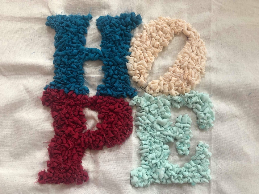
- Hope Ragrugging
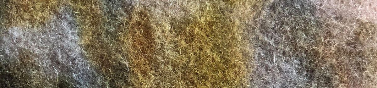
- Sketchnook